Page 3 of 3
Posted: Sat Dec 03, 2011 11:48 am
by polop
I think KORG could make an effort for a machine which costs this PRICE

this is not a Toy
TO take example on ROLAND

Posted: Sat Dec 03, 2011 9:51 pm
by Zeroesque
I sincerely hope Korg does not "update" the graphics in the Kronos or future workstations in the manner that people are talking about. It's a tool and should function easily and efficiently way before it looks like a hot new website. I find each new version of the DAWs that I use to be more difficult to operate than the last one, with the sweet spot for MIDI editing form/function to be MasterTracks Pro circa 1995 and the sweet spot for audio editing to be a Pro Tools or Nuendo version from about a decade ago. The graphics that have been put into these things since then have usually been to the detriment of actually using the program, though they do look cooler to the people sitting behind the engineer (thus increasing sales, perhaps).
The Roland screenshots all seem to have a contrast that's best for reading in the dark and also seem to show less info than the compared Korg shots. I know which one I want to use.
Posted: Sat Dec 03, 2011 10:41 pm
by jimknopf
+1
Even if the Korg UI design can be improved, it should NOT be eye-candy, and NOT follow Roland designs, but should follow its own way of functional design.
Posted: Sat Dec 03, 2011 10:48 pm
by polop
hi

I respect your vision but I would prefer to have the choice, a template mode for change graphic it's very good, for me the actual graphic are very bad, i had a motif xs and Yamaha had excellent idea with template skins graphic, with this template you can change or not the visual and all people are satisfaient.
Posted: Sun Dec 04, 2011 12:23 am
by michelkeijzers
I understand graphics is quite nice for a gimmick, but I rather have Korg time spend their probably costly development hours to things that really care, like sounds, samples, engines and UI usability.
Posted: Sun Dec 04, 2011 12:27 am
by X-Trade
Would you rather they spent the money on developing better sounds and features, or making the UI look pretty?
I like the Korg UI, it is informative and not too fussy. It's functional, which is what you expect for a technical craft tool.
I'd admit it's not brilliantly beautiful, but that's missing the point - it's unnecessary and even a waste of Korg's resources that could be spent on better things.
Being able to select the colours perhaps, might be nice - like in a number of major software DAW products currently available. But we don't need fancy graphics..
Posted: Sun Dec 04, 2011 12:45 am
by michelkeijzers
There would be some items that would increase the UI usability, like a symbol or small level meter to show which timbres are actually sounding (a simple icon in every tab would be more than enough tough).
And some menu functions to find out which program is used by what combi and some intelligent copy/paste functionality.
Posted: Sun Dec 04, 2011 2:29 am
by polop
Posted: Sun Dec 04, 2011 10:39 am
by X-Trade
Well those last two relate to Features - Piano Roll, Track View, Level Meters would be good too.
But these are features. I don't think the general 'look and feel' is worth worrying about on the other hand.
Posted: Sun Dec 04, 2011 10:57 am
by EXer
polop wrote:
I don't care a f¤cking damn about having pictures of a saxes and trumpets on the screen of a synthesizer!
That's all about marketing to catch the attention of the prospective buyer in a music shop, that's not about making music.
What I want is good sounds and a functional UI, which the Kronos has.
Nevertheless there are areas where the Kronos UI can be improved:
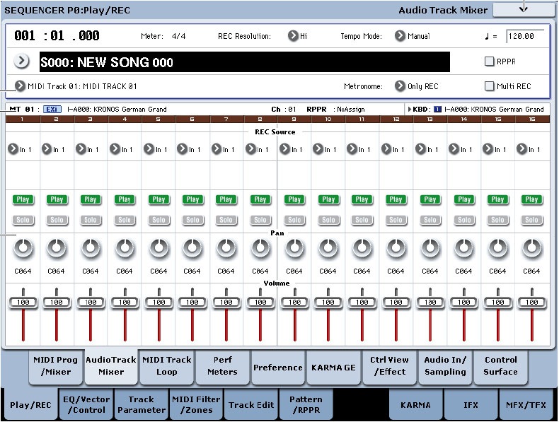
• bigger fonts and bigger virtual buttons on the touch screen
• adding Touch Drag edit like on the M3 Xpanded
• adding Piano Roll edit and Track View edit like on the M3 Xpanded
Posted: Sun Dec 04, 2011 11:47 am
by polop
Piano Roll, Track View, Level Meters
I agree but with template skins for that which wants to change the look or small pictures for the category instruments and it 's perfect.
This big screen can be better used, after it's a simple discussion, i really do not believe that korg will do something (piano roll ect..) or for 2013


